Being taught through inspiration
A wonderful producer who I’ve worked with for years would often joke when we had to copy and paste items from one of our earlier projects into something we were currently working on, “If you’re gonna steal, steal from the greats!”
Now, before we get anything further into my reasoning here, I am just gonna say the following: Don’t steal, or infringe on someone else’s work and try to pass it off as your own. That’s just theft, and it’s pretty low. As a graphic designer of over 20 years, I’ve had numerous designs and concepts stolen from me and it’s a terrible feeling to see someone else benefiting from your hard work. As artists, our biggest billable asset is our ideas, innovation and process. So respect other artists’ work as you would like your own work to be respected.
With that out of the way, I do also believe that you can learn a lot by seeing how other people approach their craft. That is, at its very core, the essence of teaching. Recent generations of photographers have been inspired by people like Annie Leibovitz, Joe McNally and Jeremy Cowart, among others. Those photographers were, and still are, inspired by other photographers and so on and so forth. Being inspired by other artists is a beautiful thing and, as an artist, there is no higher compliment than having a contemporary seeing your work and being inspired by it.
I keep a folder on my computer of things I find inspiring. It can be anything from a color study, to a well designed website, brochure, a photo, a poem; it can be anything that catches my eye and stirs some emotion inside of me. In the case of photography, it could be an image that someone else has taken that intrigues me – the way they took it, the lighting, the pose, the setting. Whatever it is, it’s something that has inspired me.
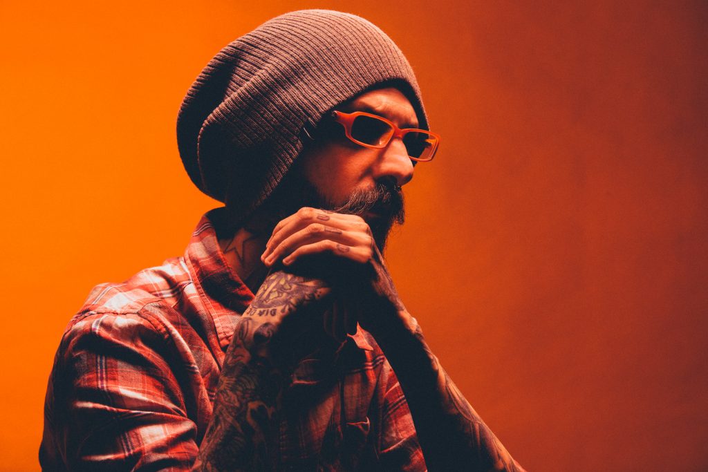
 I’ll also use these images as a challenge and a chance to learn. I’ll do my best to figure out what sort of visual trickery and craftsmanship went into the making of their photo and then I’ll set out to see if I can faithfully recreate what it is I think they’re doing. Such was the case for Post Malone’s Twitter profile picture seen here to the right. This photo was shot by Nabil and you can follow him on twitter here: https://twitter.com/nabildo.
I think it’s just a pretty awesome portrait. I like the simple, monotonistic color scheme, the pose, the shadows. Basically, the whole mood of this photo is pretty damn cool. Because of that, I decided I would do my best to try and recreate it armed with only my own working knowledge of cameras and studio lighting.
The first, and most obvious, aspect of this photo is the orange tone throughout. That’s a no-brainer that we’ll need to add some colored gels to the lights in order to achieve the same effect, however we need to figure out what sort of lighting we want to use first. Looking at this portrait a little more I suspected that the photographer was using a beauty dish, positioned directly above and pointing straight down at the subject. This would give the same deep shadows in the eyes we see here in the photo. There doesn’t seem to be any bounce light, so we’ll just move forward on the assumption that one one light was used to light Post Malone.
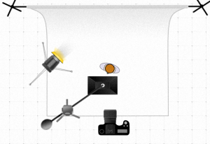
We will need a second light, however, to light the backdrop. I have a neutral gray seamless in my studio and I suspect that’s the same setup Nabil used in his photo. So, I’ll just take my second light, attached a 7 inch reflector dish so the light doesn’t spill off of the background and hit the subject, and then lastly we’ll put a gel on that to give our gray background an orange tone.
The gels I decided to use were one full cut of CTO on my main light and one theatrical orange gel on the background light. The theatrical orange gel is considerably more orange than the CTO gel. The reason for this choice is because skin tones are already warm-ish, so I don’t need to over drive the orange on our main light – just enough extra orange to kick the skin tones into the realm of our backdrop. The backdrop, which is gray under normal lighting conditions, does need a little more color oomph, so that’s where we use the theatrical orange gel to full effect. See the diagram to the right to see our final set up.
The next step is lighting ratios. I think I got kinda lucky on this one. My camera and lights were still set to whatever they were set for at my last photoshoot was and, as it turned out, they were dialed in pretty well for our first test shot here. In the end, I just had to tweak the main light at tad to get it into the correct range. My camera was set to f/8, 1/125 shutter, 100 iso. The main light was putting out light at f/11 and the background light was f/5.6. So basically, the key light was +1 stop over camera and the background was -1 stop under. Easy-peasey!
And here’s our final image:


